mac-device
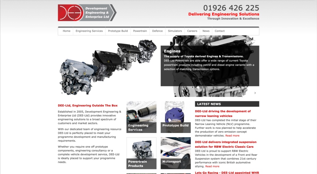
after image before image
Dee logo before & after

Logo Evolution

We created Dee’s original logo way back – so being able to bring it into the 21st century was an exciting challenge. Using a simple colour palette of dark blue, light blue & white along with orange making the call to actions stand out . The main update was making the DEE letters stand out – so that the company name is the main focus.

Dee Ltd responsive development

Development

The website was built in WordPress using a custom theme to make use of the easy to use Content Management System that would allow DEE to take control of the content on the website. Using animation, we highlighted the main 5 capabilities using HTML to create a gradual line that appears as you scroll as well as making the logo animated across the site.

We used a video on the homepage to showcase a 3D prototype CAD drawing that was created by the team at DEE so that visitors to the site can see a breakdown of the full design process.

confetti image
have an idea icon

Have an idea?

We can put a free quote, partner with businesses and help get funding for your project. Let's Talk!

Blogs from our team

MORE INSIGHTS
Copyright © 2024 ImagePlus. All Rights Reserved.
scroll to top