Insight
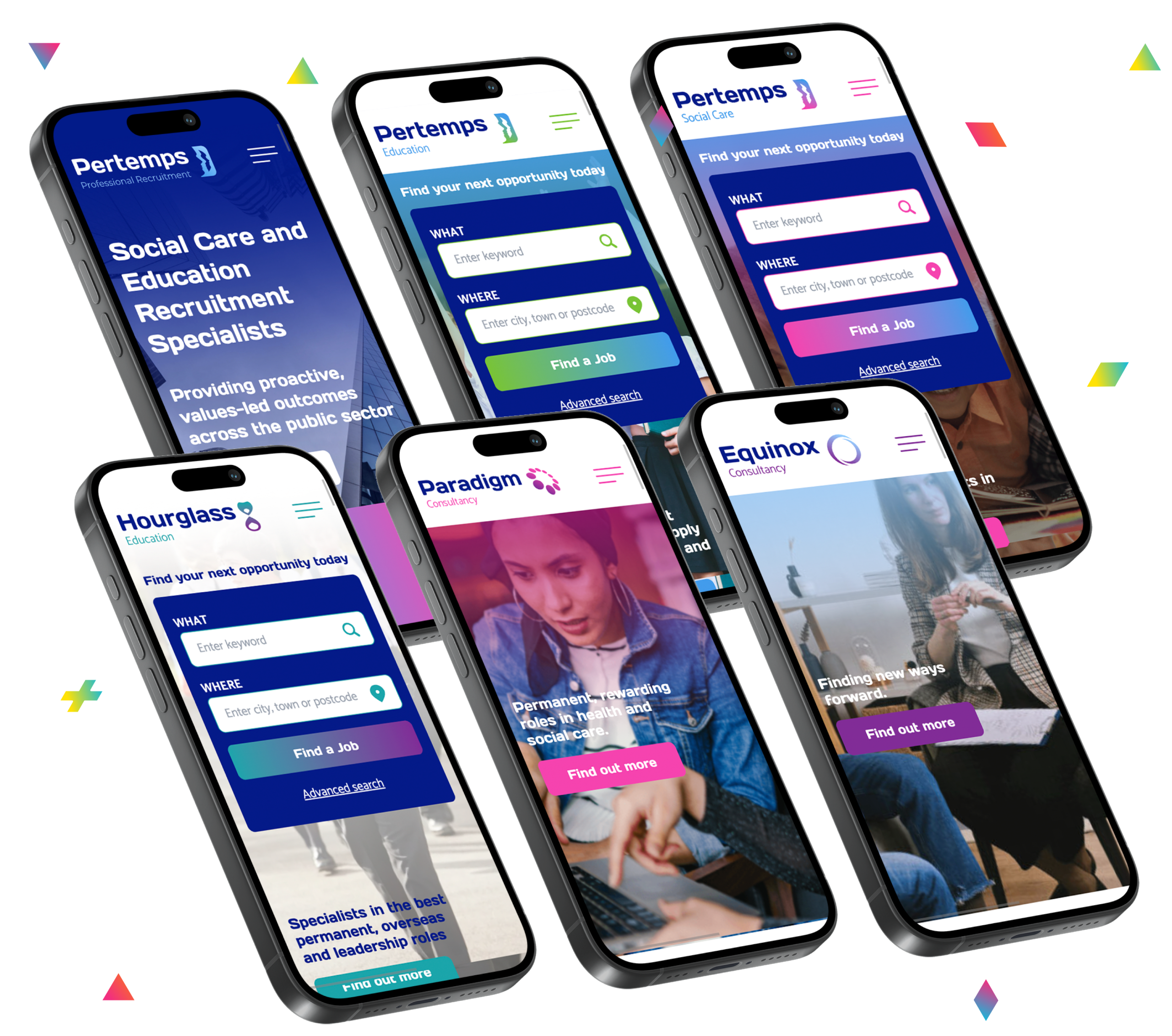
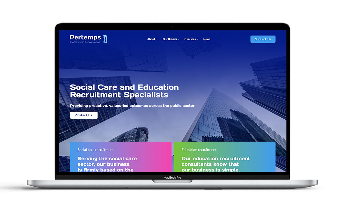
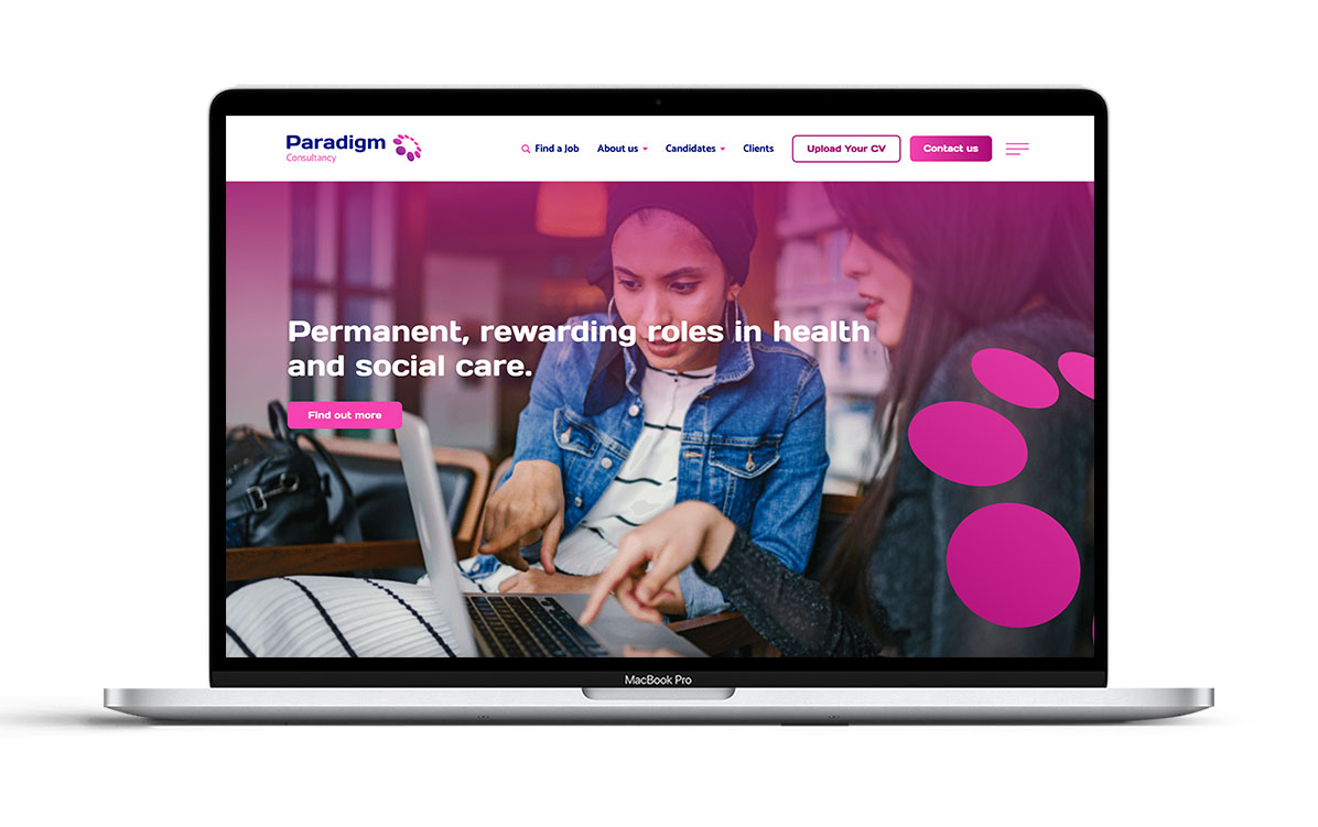
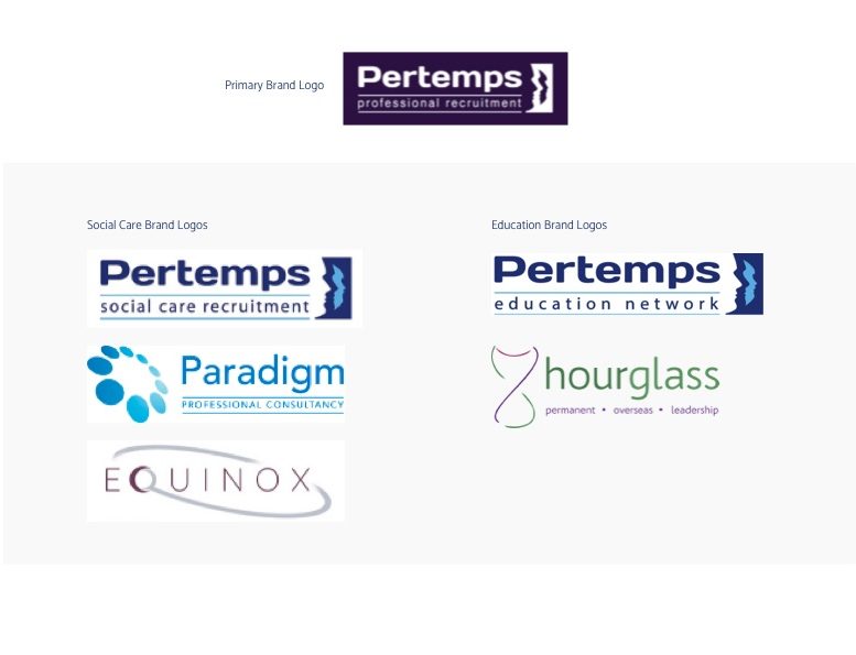
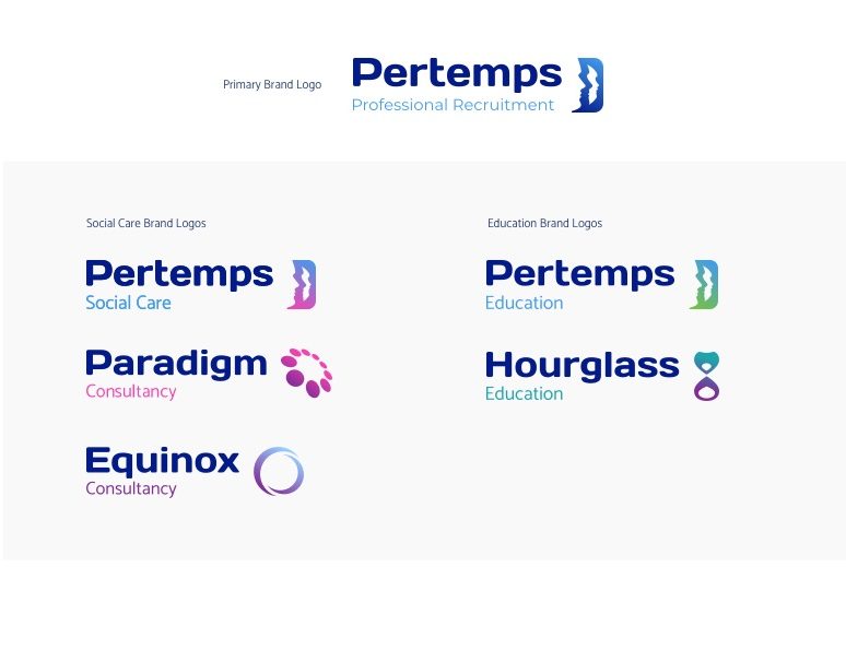
PPR are a franchise that belong to the wider Pertemps Recruitment Network. Their previous brand presence was dated, incoherent and their websites were not performing as best as they could.
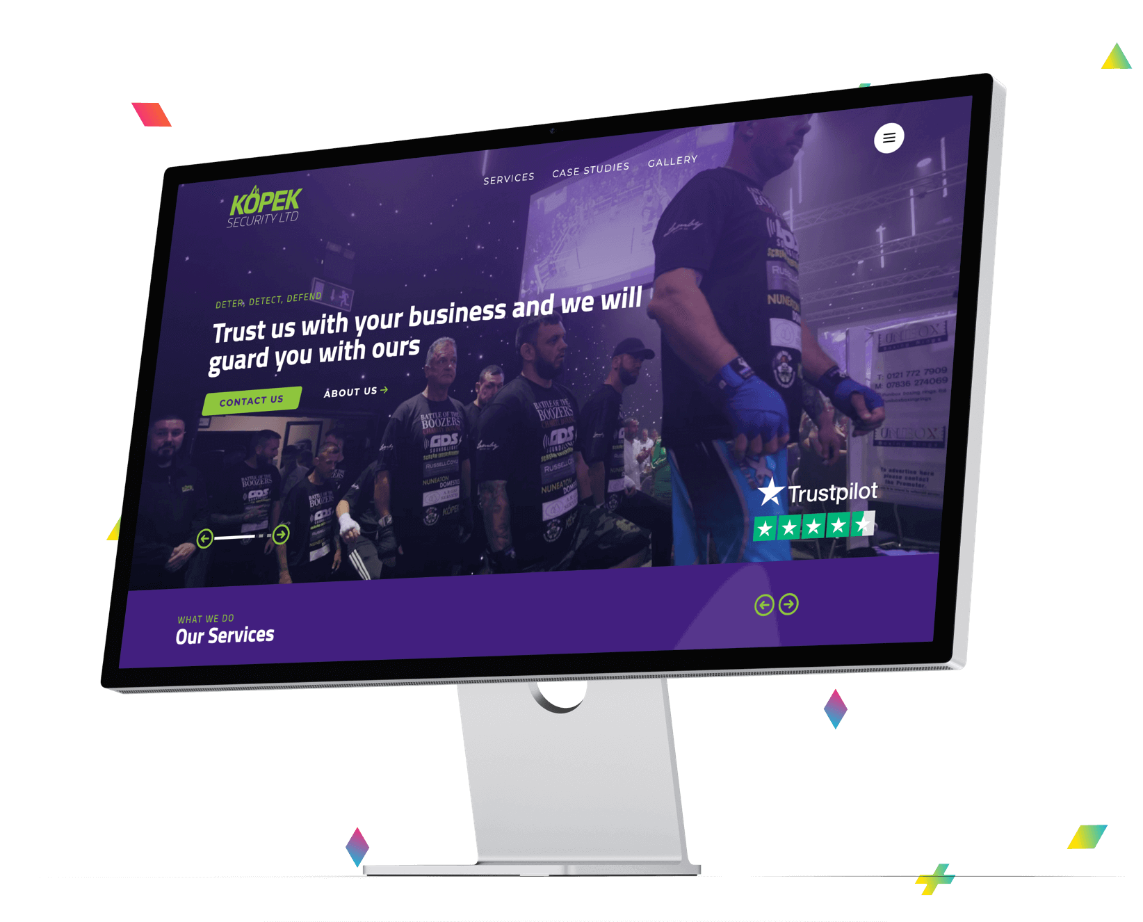
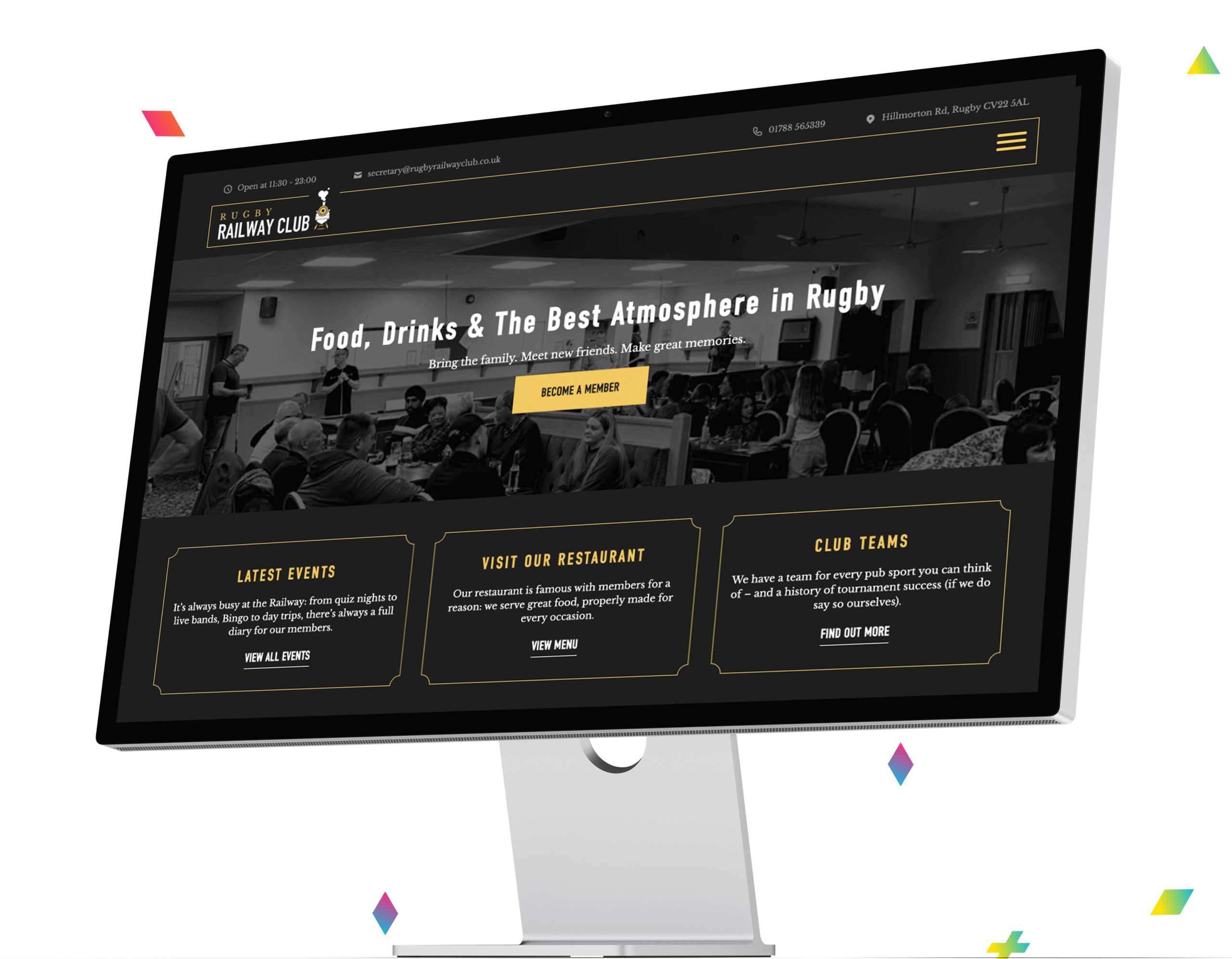
We worked with PPR to produce 6 brand identities which reflected the Pertemps Network brand rules as well as maintaining some of the existing brand logo elements and recognition. As well as this we were then commissioned to redesign and redevelop 6 recruitment websites.